Visual Channels and Encoding Accuracy: Designing with the Brain's Perception in Mind
How to choose the right visual variables for different types of data and avoid perceptual mistakes

I'm a versatile tech professional working at the intersection of Machine Learning, Data Engineering, and Full Stack Development. With hands-on experience in distributed systems, pipelines, and scalable applications, I translate complex data into real-world impact.
Summary
In this fourth article of the Cognitive Design for Visualization series, we explore how different visual encoding channels—such as position, length, angle, area, and color—affect the accuracy and interpretability of visualizations. You will learn how human perception ranks the effectiveness of different encodings, why some channels are inherently more accurate than others, and how to avoid misleading design choices. The article bridges scientific insight with practical application: we pair theory with examples, real-world visualizations, and actionable design rules for beginners and professionals alike.
Coming next: A deep dive into color perception, color spaces, and effective color palette selection for data design.
1. Introduction: Why Visual Channels Matter
Every visualization uses visual encodings to represent data. These visual encodings—called visual channels or visual variables—are how data values are translated into what we see: positions on a chart, lengths of bars, color hues, and more. However, not all channels are equal in terms of perceptual accuracy.
Choosing the wrong encoding can make charts misleading or hard to interpret, even if the data is correct. Choosing the right one can make insights intuitive, fast, and trustworthy.
Design Tip: Don't just pick a chart type. Pick the right channel for your data.
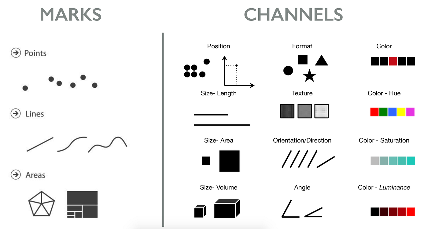
2. What Are Visual Channels?
Visual channels are the building blocks of visual encodings. They can be spatial, color-based, or shape-based.
Common Channels:
Position (on common scale): e.g., x/y position on a scatterplot
Length: e.g., height of a bar
Angle: e.g., slices in a pie chart
Area: e.g., size of bubbles
Color (hue): e.g., category in a map
Color (lightness/saturation): e.g., heatmap value
Shape: e.g., symbol types in a legend
Texture/pattern: e.g., crosshatch vs. dot-fill
Design Tip: Understand which channels work best for your data type (quantitative, ordinal, categorical).
3. Ranking Channel Effectiveness (Cleveland & McGill, 1984)
Perceptual studies show humans are better at interpreting some channels than others. For quantitative data, here is the ranking from most to least accurate:
Position on common scale
Length
Angle/Slope
Area
Color (lightness/saturation)
Volume
Color hue
Shape
Practical Example:
- Showing values using position (e.g., dot plot) is more accurate than using area (e.g., bubble chart)
Design Tip: For precision, favor position and length. Use area and color for approximate comparisons.
4. Matching Channels to Data Types
4.1 Quantitative Data
Best channels: Position, length, lightness
Use when comparing actual values, differences, or trends
Example: Use bar charts or dot plots for showing GDP by country.
4.2 Ordinal Data (ordered but not numeric)
Best channels: Position, lightness, hue
Avoid: shape or hue without order
Example: Use a sequential color scale for ranking product performance.
4.3 Categorical Data
Best channels: Hue, shape, spatial grouping
Avoid: color saturation or size
Example: Use color hues to differentiate countries in a map.
Design Tip: Align your channel with both data type and user task.
5. Encoding Pitfalls and How to Fix Them
| Problem | Example | Fix |
| Misleading area encoding | Bubble size ≠ true proportion | Use bar or position instead |
| Overuse of color hues | Too many category colors | Limit to ~7 hues, use grouping or legends |
| Wrong encoding for precision task | Pie chart for small differences | Use bar chart or dot plot |
Real-World Case:
A pie chart comparing 10 market shares makes it hard to detect 2% differences.
A horizontal bar chart with sorted order enables fast comparison.
Design Tip: Ask: "Can a viewer read this value or compare it within 5 seconds?"
6. Combining Channels: When and How
Visualizations often use multiple channels together. This increases data density but can also reduce clarity.
Example:
- Bubble chart: uses x-position (time), y-position (value), size (magnitude), and color (category)
Problem: Size + color = high cognitive load
Fix: Remove one channel, or use interaction (tooltips, filters)
Design Tip: Don’t layer more than 2–3 channels per mark unless truly necessary.
7. Tools, Resources, and Visual Demos
ColorBrewer2: Evaluate safe and accurate color scales
Data-to-Viz: Chart chooser by data shape
Cleveland & McGill paper summary: Perceptual Accuracy Ranking
Suggested diagrams:
Accuracy ranking chart (bar format)

Examples of good vs. bad encodings

Encoding matrix (data type vs. best channels)
![4. Choose Appropriate Visual Encodings - Designing Data Visualizations [Book]](https://www.oreilly.com/api/v2/epubs/9781449314774/files/httpatomoreillycomsourceoreillyimages898026.png)
8. Guidelines and What’s Next
Practical Guidelines
Favor position and length for exact value display
Match channels to both data types and cognitive goals
Avoid misleading area/angle use in proportion charts
Limit channel layering to reduce cognitive burden
Coming Next:
Blog 5: Color Theory and Perception in Visualization
- Learn how the brain perceives color, the science behind color spaces, and how to use color responsibly and inclusively in data design.
Choosing the right visual channel is not just a design choice—it's a cognitive one. The next article continues this foundation with a focused study on color.


